
22:27
hamerkaz_1202_1203
653
Posts
1165
Folowers
596
Folowing
hamerkaz_1202_1203
מרכז סיוע לנפגעות ונפגעי תקיפה מינית
www.1202.org.il
Folowing
Message
Contact
מחלקת חינוך
standfor

ביחד
סיוע
קבוצת תמיכה

hamerkaz_1202_1203
Tel Aviv

hamerkaz_1202_1203
Tel Aviv
hamerkaz_1202_1203
Tel Aviv

Social media templates

Branding
HaMerkaz
This project won second place in the rebranding competition for HaMerkaz - support for survivors of sexual assault in Tel Aviv.
Why ripples?
When a person experiences any kind of pain, the pain creates ripples.
Family, friends, and the community are all affected and relied upon to
support the person in pain.
But when the harm remains a secret, no ripples can form.
The survivor is left alone, feeling as though they have no voice.
In that sense,The Center is the first ripple of many. This is the place where
the assault is acknowledged and the survivor’s voice is heard for the first time.
From there, the story moves outward influencing awareness and even legislation.
1st ripple: Family and friends
The center helps the survivor share their story,
and avoid segregating themselves.
2nd ripple: Community and Work places
The center offers support groups and collaborates with “Standfor” to educate work places on how to avoid and address sexual harassment.
3rd ripple: Society and the future
The center works to change legislation and collaborates with “Together” to teach teenagers about healthy sexuality.
Colors and typografy
The purple tone: I chose to keep the purple tome from the previous identity to honor the survivors who already found support at the center - maintaining continuity and emotional grounding.
However, the new shade is more vibrant and energetic, conveying life, hope and strength.
Main font: Greycliff Hebrew CF
For the logo and headlines, use Heavy
For secondary headlines use Demi bold.
For text, only in small amounts, use Thin
* the C in “Center” was redesigned
and is not a part of the font.
Secondary font: Assistent
Use Regular
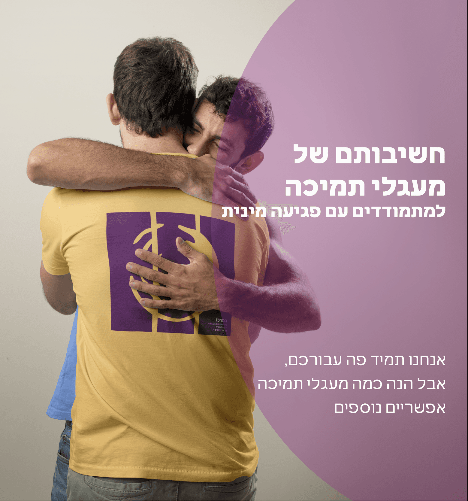
Design Strategy
The previous visual identity featured a hug - a symbol the
team no longer wanted to be associated with.
While a hug can communicate warmth, it may also imply
silencing, comforting too quickly, or glossing over pain.
The organization wanted to shift the focus toward giving
survivors the space to speak out and allowing their stories
to create impact.
No hugging
No hand or stop signs
Convey the range of support
The old logo

The new logo
Merchandise
The fashionable line
This collection is designed to be approachable and widely appealing.


The protest line
This collection is bolder and is fitting for demonstrations or advocacy events.

The help line
This collection is designed to offer help quietly, without drawing attention.

Collaborations

Email signature and Business cards

